As a power pages developer, most of us are familiar with writing “Web Templates” using liquid to design our portal layout and templates. However, the opportunity to use your web template as a component can be beneficial when dealing with redundant code or complex requirements.
Initialising the component
To add a component to your webpage, you can copy the following code and edit it as per your component:
{% include '<<web template name>>' <<parameter 1>>: '<<value>>' <<paramter 2>>: '<<value>>' %}For instance, to include the component (with default) created in this you would use the following code:
{% include 'alertscomponent' %}Defining the component
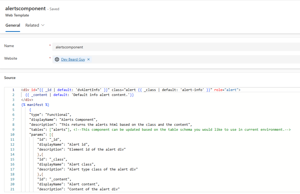
The liquid code of your “alertscomponent” component will be as follows:
<div id="{{ _id | default: 'dvAlertInfo' }}" class="alert {{ _class | default: 'alert-info' }}" role="alert">
  {{ _content | default: 'Default info alert content.'}}
</div>
{% manifest %}
    {
    "type": "Functional",
    "displayName": "Alerts Component",
    "description": "This returns the alerts html based on the class and the content",
    "tables": ["alerts"], <!--This component can be updated based on the table schema you would like to use in current environment.-->
    "params": [{
        "id": "_id",
        "displayName": "Alert id",
        "description": "Element id of the alert div"
        },{
        "id": "_class",
        "displayName": "Alert class",
        "description": "Alert type class of the alert div"
        },{
        "id": "_content",
        "displayName": "Alert content",
        "description": "Content of the alert div"
        }]
    }
{% endmanifest %}
In the dynamics environment, you’ll be creating the component with following attribute:

Including in web page template
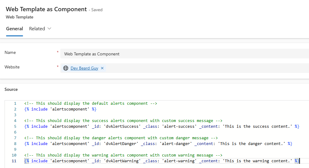
The component created is reusable and can be initialised at multiple occurances. Since, it is a parameterised component it’s behaviour may vary depending upon the parameters provided upon each instance as shown below:
<!-- This should display the default alerts component -->
{% include 'alertscomponent' %}

<!-- This should display the success alerts component with custom success message -->
{% include 'alertscomponent' _id: 'dvAlertSuccess' _class: 'alert-success' _content: 'This is the success content.' %}

<!-- This should display the danger alerts component with custom danger message -->
{% include 'alertscomponent' _id: 'dvAlertDanger' _class: 'alert-danger' _content: 'This is the danger content.' %}

<!-- This should display the warning alerts component with custom warning message -->
{% include 'alertscomponent' _id: 'dvAlertWarning' _class: 'alert-warning' _content: 'This is the warning content.' %}
Output
The output of the following page should as follows:

Лучшие модели дизайнерской мебели премиум-класса.
Дизайнерская мебель премиум-класса [url=byfurniture.by]byfurniture.by[/url] .